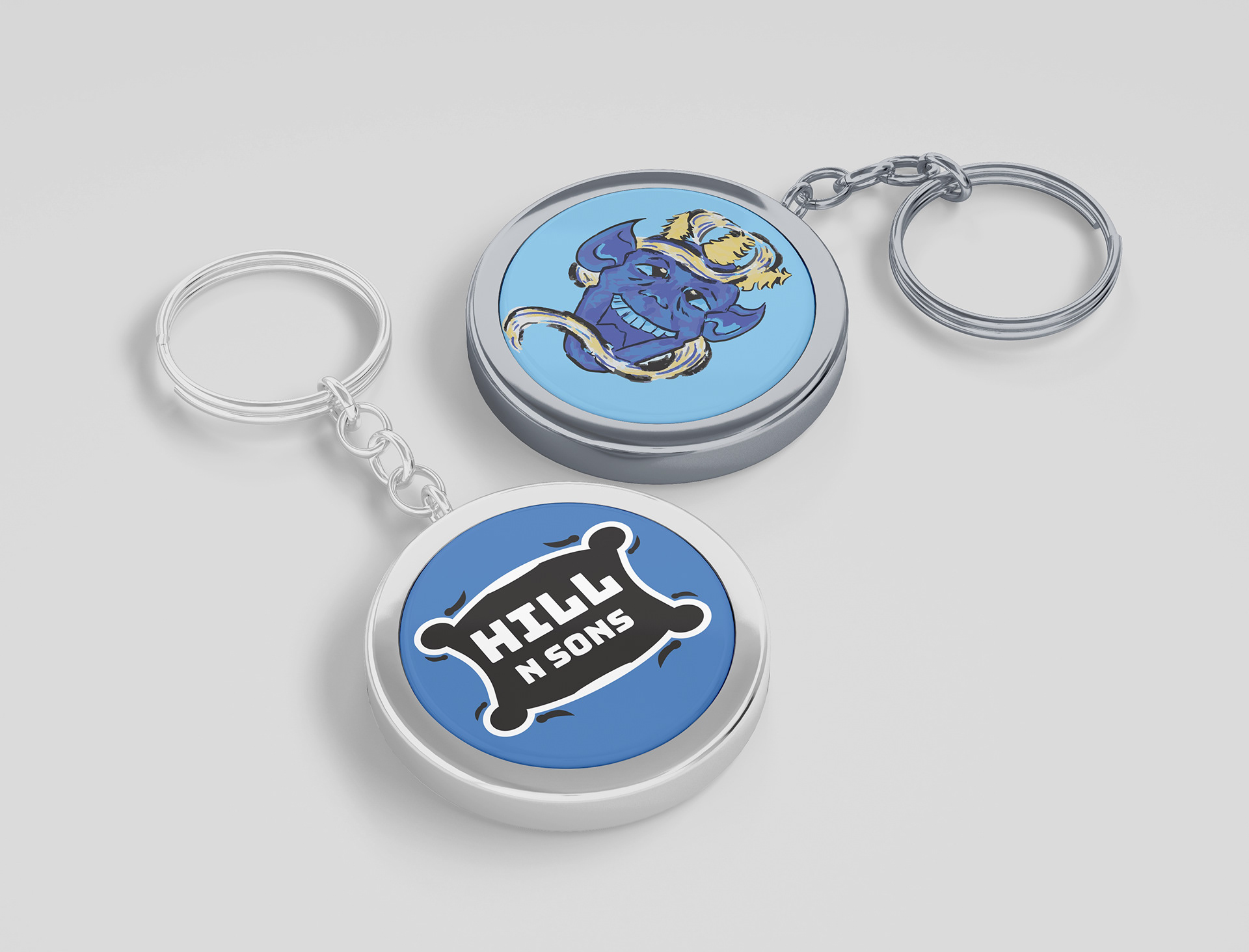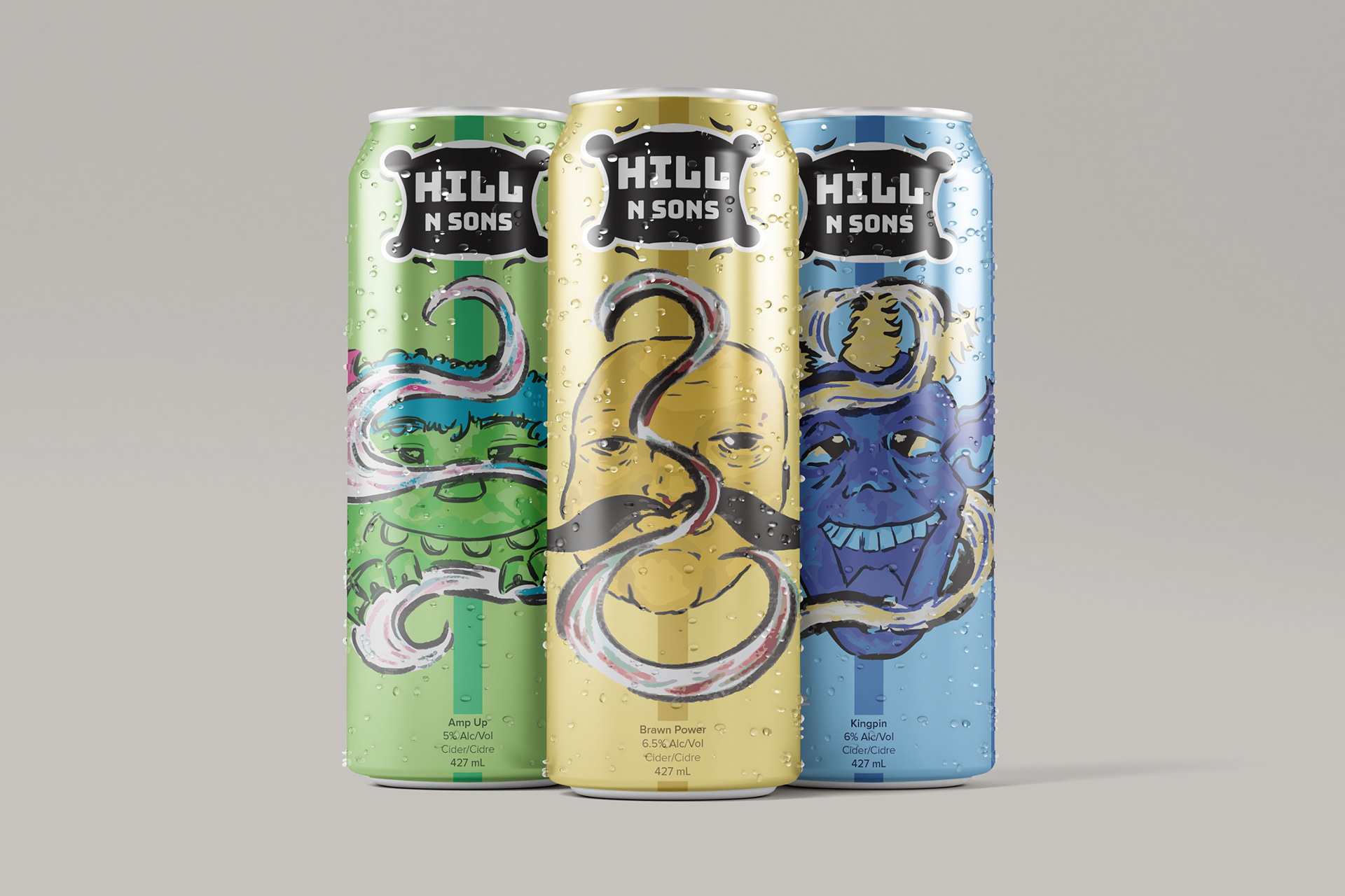
During the beginning stages of this project, my initial thought was to go with something that would be fun and very colourful to represent a type of high energy environment you might drink beer at. My concept for the brand evolved into a circus, carnival inspired concept and I created characters that represent 3 distinct personalities; the leader, the rambunctious younger, and the muscle man, who exist in one group. The first character for the ‘Kingpin’ flavour uses a colder blue and yellow colour palette to emphasize a calm level headed personality. The name ‘Kingpin’ I chose because in the case of bowling, it is the pin in the center, with all other pins stood behind it, so I drew inspiration from that for its name, to highlight the leader character and second strongest alcohol percentage. For the character that goes with the flavour ‘Amp Up’ I went with a brighter colour palette that highlights the second strongest alcohol percentage out of the three and to balance the darker blues, and yellows and reds in the other cans. The name I chose is to represent the effects of the beer and a sweeter flavour. For the third can ‘Brawn Power’, it’s the strongest alcohol percentage out of the three, so I took inspiration from the saying “Brain over Brawn”. The colour palette for this can was originally brown and red shades at first, but after seeing all 3 together I decided to go with yellow shades for the figure instead as I thought it brought all cans together more. For the Hill and Sons logo I looked at old carnival posters, and decorative labels and designed using some elements seen in both, like frames, and decorative illustrations to connect the concept to the brand.